This tutorial was made to help step you through the process of making a Na’vi from the AVATAR movie.
Creating posters with Photoshop can be a lot of fun and there are unlimited opportunities. Anyone who knows me knows that I love movies. I recently was overcome with inspiration when I saw the new James Cameron’s Avatar Movie Posters, they are pretty sick. In this tutorial I will show you guys some simple but efficient techniques that will help you make your own Avatar movie poster from a portrait picture of yourself. This tutorial should be used with many variants and additional techniques unique to the artist.
Note: The version of Photoshop that I’ve use is CS4. You can buy it from Adobe.com (buy it, not download it for free).You can also download a 30 day trial from here.
Note: The version of Photoshop that I’ve use is CS4. You can buy it from Adobe.com (buy it, not download it for free).You can also download a 30 day trial from here.
UPDATE:
I’ve got a lot of emails from people who wanted me to ‘Avatarize’ their pictures. I can do it for you for a small donation, just send me a message at: icanbecreative @ gmail.com
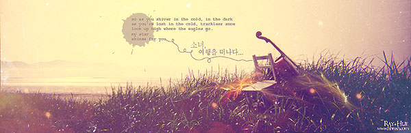
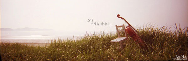
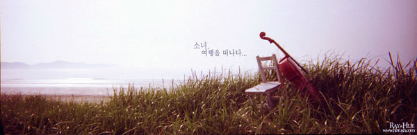
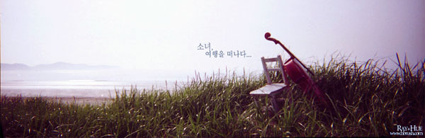
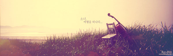
This is the original picture:

This is what we are going to create:
Step 01
The first step is to show you from what pictures i get my inspiration:
Step 02
Step two is preparation. First, make sure that the picture you’re working with is as large, clear and high quality as possible, the quality of the original picture will determine the quality of the final product.
Download the photo that we’ll be using for this tutorial: Download link
Step 03
Open the picture, duplicate the background picture layer (now you should have two copies of the same image in your layers menu) and use the Healing Brush Tool (select the source from the forehead area, or something similar) to recreate the nose which is flatter and broader as compared to the average human nose.

Step 04
Select the skin areas of the model with the Lasso Tool, like in the picture below, and pres CTRL+U to open the Hue/Saturation menu.


Step 05
Now we are going to make the shadows for the nose. Select with the Lasoo tool the areas like in the picture below, pres CTRL+C and CTRL+V (to copy/paste to a new layer) and set the Blend Mode to the new layer to Multiply. Go to Filter > Blur > Gaussian Blur and set it to 2.9

Repeat the process 2 times for the other side.
Step 06
Duplicate the layer from the step 04 and put in on top the nose shadows layers. Select the lips and the nose with Lasso Tool and pres Ctrl+U to open the Hue/Saturation menu again. Hue to +99 until you get a pink color.

Set the Opacity to 54% until you get the lips and the nose to a purple color, and the shadows of the nose to be less visible. Take the picture below for example:

Make all the layers Flatten if you are sure if you are satisfied with the result so far.
Step 07
Here comes the most difficult part, the nose and the eyes. I used Liquify in the “Filter” menu, and simply moulded the nose and the eyes into that of a Na’vi’s face, while checking back and forth on actual screenshots.
For the nose use the Forward Warp Tool to make it more flatter (from the Liquify options) and for the eyes use the Bloar Tool to make them more bigger .

Extra styling: The lips of the model are very big, try to make the smaller with the Forward Warp Tool.

Step 08
Na’vi irises are considerably larger than human irises in relation to the size of the whole eye.
Make a new copy of the last layer and with the Eraser Tool make some holes like in the image below:

Make a new layer and put it underneath the current layer, here we will put the eyes.
The eyes i used are from the picture below:

Or you can use the eyes from the official Avatar posters (change the Hue/Saturation to have a yellow color more intense):


Use the Polygonal lasso tool to select the eyes, copy and paste them below the layer where you did the “holes”.
Enlarge the eyes until you feel the size is good (one eye at a time). Use Eraser to remove imperfections. Adjust the shape of the eye with Liquify.
Enlarge the eyes until you feel the size is good (one eye at a time). Use Eraser to remove imperfections. Adjust the shape of the eye with Liquify.

Step 09
For some extra styling we will add some eyelashes, download the brushes from here, and aply them like follow (use your imagination to adjust them until you feel the size is good):

Step 10
Let’s put some stripes on our model. Download the zebra stripes patterns from below (right click > save as):


Add one of those patterns as a new layer. Go to Filter > Liquify and using all the tools make something similar like what i did:

Erase the right side:

Duplicate this layer and go to Edit menu > Transform > Flip Horizontal and join them like in picture example below:

Make them as one layer. Set the Opacity to 18%. Move the stripes to the model’s face:

Use the Eraser tool to leave only the stripes from the face area. Set the Blend Mode to Soft Light. Repeat the process for other skin areas.

Step 11
To add the bioluminescence dots make a new layer and use a small brush, make may dots of different sizes. They’re generally pretty heavy on the nose, brow, under the eyes, at the corner of the mouth and running down the neck.
Go to Layer > Layer Style > Blending Options > Outer Glow and set it like this:

Group the layers to a folder (while the dots layers are selected pres Ctrl+G). Set the Blend Mode of the folder to Pass Through.

Extra styling: Add some dots on the arms.

Step 12
I found a good quality still of a Na’vi ear and imported in into my file, then isolated the ear usingLasso Tool, then re-sized it and placed it where I wanted it to be.
To make the ear more real, go to Filter Men > Filter Gallery, the go to the Artistic effects and selectPlastic Wrap.

Mask the ears with some hair, use the Dodge Tool to brighten the left ear and the Burn Tool to darken the right ear.

Step 13
This part is the most request from all the tutorial. Let’s add some Leather Texture to our model. I’ve prepared for you a large, clean and high resolution leather pattern.

Lay the leather texture image on top of the face (an other skin areas), and repeat it over as many times as it takes to cover the face. Don’t stretch it, just duplicate it. Once you have done this, merge all the layers together (by holding shift and selecting every layer that has the leather texture and goinf Right Click > Merge Layers). Once they are one single layer make sure you erase the eyes and lips with the Eraser tool and change the layer style to Overlay and the Opacity to 15-25% (adjust until you feel the opacity is good). Try to put this layer under light dots layer.

From now it is just adjusting minor details to your image, and adding your own little touches here and there.
The Final Result

Avatar Font
The font used for the movie is very similiar to Papyrus (windows default). Let’s re-create the title effect:

Ok, after that apply Outer Glow and Gradient Overlay layer styles to this layer:


Dramatic Movie Like Effects
This part is only for extra-styling. We are going to play around with the coloring now so go to Image > Adjustments > Color Balance. Select the Midtones radio button and in the three Color Levels boxes, enter these values: +46 +11 +13. Now select the Highlights radio button and enter these values: +26 +16 -10. Again, you can play around with these settings if you want a different look.


Now we are going to add some lighting to this layer, so go to Filter > Render > Lighting Effects and select the options like in the image below. Play about with the angling settings until you get something that you like.

Conclusion
Finally, we are done with our avatar movie character and poster creation in Photosop. I hope this tutorial helps lead you in the righ direction! Please post you Na’vi Avatar picture that you made from following this tutorial, i would love to see them! And please, if you have any question, feel free to ask, I am here to help!
This tutorial focuses on using a simple photo, but with a little extra effort you can achieve some amazing results using very complex photographs. This tutorial will teach you how to easily create swirly works of art, and give the appearance that it is entirely composed of vector shapes, following an increasingly popular design technique.
This is the image we’ll be creating:

The first you open the original picture below (source: from fatoe.com, sorry i can’t find the original picture of the girl):

Now to work on your image’s background. Make a new layer and fill it with black.
Duplicate your original photo layer and put it on top of the black one (see picture below).

Set the layer’s blend mode to Hard Light.

Select the last layer (from the above picture) and then go to Edit > Define Pattern.
Define your pattern as ‘Girl’ or whatever you want to call it.

Now grab a free swirly brush set such as this one. Create a new layer above your hand layer called ’swirls small’. Then use various swirly brushes from your set to brush over your hand. I used a purple brush color just to highlight where I’d placed my brush strokes. Try to use as many of the brushes as possible, varying size and positioning to create a random mess of swirls covering most of the hand. Don’t worry about going over the edges!

Extra Styling: For a good effect, try in this layer to use small brushes. Make another layer above and name it ‘swirls big’, and use bigger size brushes.
Go to Layer>Layer Style>Blending Options. Add a drop shadow to your swirls just to give them slightly more depth/impact.

Now for both layers with swirls, go to Layer>Layer Style>Blending Options and change thePattern Overlay like in the picture below.

Now hide the background layers like in the picture below. Your layers should look like this:

I would suggest the burn/dodge tool on the edges to give them slightly more depth.
And we’re done! You can see the final result below. This technique can be applied to any image using any vector shapes. The key to making it look convincing is matching the vector objects to the shape, contours, and flow of the object image they’re to be wrapped around. It’s an odd effect, but I hope you were able to gain something from this tutorial, and good luck with your own work!
Design Inspiration: Alberto Sevenso
Watercolor is one of those effects that can be difficult to replicate digitally, but with a little practice and experimentation I think you’ll find it can be rather fun.
This tutorial will be based around creating a really cool watercolor effect, but this technique works just as well when creating paintings in Photoshop.
Step 1
The first step here is actually the first step in all my projects. I look for references images based on a sketch that i have in mind. This research and planning process is intertwined. It allows me to look through various elements and plan the direction to follow. Of course, I can change the direction during the creation as this process is fluid.
Step 2
Create a new document in Photoshop, I used a wallpaper size of 1920 pixels by 1200 pixels.
Download this old paper texture pack, and place the Paper 2.jpg in your document.

Step 3
Now let’s use some brushes, in this case the fantastic Bitbox set of watercolor brushes. Go ahead and download these watercolor brushes. Bitbox has some other amazing watercolor brushes as well, so feel free to test different ones as well.
Create a new layer and select the Brush Tool (B) and blue for the color. Create a new layer, then with just one click paint place some paint on the layer. Select a different brush and use red for the color. Also you can try different Blend Modes, in this case I used Normal but you can try Multiply as well. Repeat this steps with different colors until you achieve something similar like int the picture below.

Step 4
Group all the layers with watercolor brushes and duplicate the group. You can hide one. With the other layer go to Layer > Merge Group. Rescale the layer and make it bigger, as in the image below. Then go to Filter > Blur > Gaussian Blur, and use 250 for the value. Now change the Blend Mode to Multiply.

Step 5
Select the Eraser Tool, then select a big round brush and erase some areas from that layer, mainly in the center.

Step 6
Now let’s add a nice texture on top of this layers. You can use the image of your choice, it could be parchment paper for example. I’m using the image below:

Place the image in the document on top of the other layers. After that, change the Opacity to 70% and the Blend Mode to Darken (you can try different Blend Modes).
Step 7
Now let’s place an image in our document. I’m using a photo of a girl in a field from deviantART, you can get it here.
Select the image and go to Filter>Artistic>Dry Brush. Use 0 for the Brush Size, 9 for the Brush Detail and 1 for the Texture.

Step 8
Select the image layer, after that go to Layer>Group Layer. The layer of the image will be inside a folder in the Layer Palette. Select the folder and go to Layer>Layer Mask>Hide all.

Step 9
So now, let’s use some Watercolor Brushes. The ones I use are from Brusheezy and you can download them here http://www.brusheezy.com.
So select one of the watercolor brushes and them white for the color and paint on the layer mask of the group. You will notice that the image will start showing.

Keep painting untill you can see the image without losing the brush splatters.

Step 10
Now add another layer, this time beneath the Folder that the image is in. Then again using the watercolor brushes paint over the layer using familiar colors of the picture. Use the images below for reference.


Step 11
Let’s just adjust the color of the image. Select the image and go toImage>Adjustment>Photo Filter. Select Warning Filter (85) and 20% for the Density. Also select the Preserve Luminosity option.

Conclusion
The idea of this tutorial is to show how to create a design from multiple reference images, a simple sketch, and your own ingenuity. Just place your logo and that it you will have a really cool effect and super simple to achieve. That can be used for website headers to create a simply awesome design, and, of course to create posters.
THIS IS ANOTHER HIGH QUALITY PHOTOSHOP TUTORIAL THAT SHOWS YOU HOW TO CREATE A REALLY COOL EFFECT. THE END PRODUCT IS AN AWESOME DREAMY VINTAGE PICTURE, USING SOME SIMPLE, BUT EFFECTIVE, TECHNIQUES IN PHOTOSHOP.
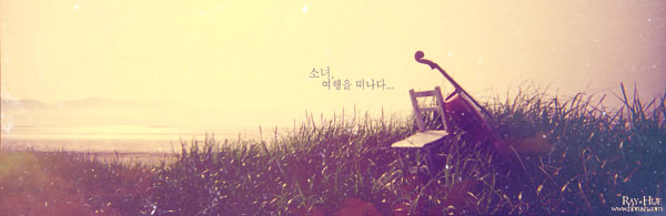
The final result of this tutorial:
The first you open the original picture below:
Press Ctrl + B (Color Balance) and set numbers as below:


Your picture will look like this:
Use Selective Color:


The result:
After that, you press Shift + Ctrl + N to make a new layer and fill the layer with the color: #14317A

Change blend mode to Exclusion, opacity: 50%
This is the result:
Use the gradient as below:

Change blend mode to Screen, opacity: 40%
Use Brightness/ Contrast

The result:
Take this texture and place it on top of your picture:
Blend mode: Lighten, opacity: 100%
Continue to put this texture:
Change blend mode to Screen, opacity: 100%
Now, take the other texture:
Blend mode: Screen, opacity: 100%

Put the last texture:
Mode: Lighten, opacity: 100%
Eraser some areas:
Eraser some areas:
You use this text brush to decorate for the picture:

Press Shift + Ctrl + E to merge all layers then go to Filter > Sharpen > Sharpen
You will get the final result:
 Sophisticated Glowing Text Effect in Photoshop
 In this tutorial we are gonna create some really sharp looking glowing text effect in Photoshop, step by step explained. I’m using a combination of layer styles, the pen tool and colour blending.
The end effect is quite stunning, if you have any question, just ask a i will reply.
Good luck!
SETUP THE CANVAS

First thing is to setup your work area. This tutorial is done on CS3 but the main screen should be pretty similar. I have chosen to work on an A4 sized canvas but you can set it up any size you wish. If your planning on printing your finished artwork make sure resolution is set to 300dpi, if your creating the art for screen stick to 72dpi. If your into professional printing set the color mode to CMYK otherwise RGB is fine, the difference isn’t generally noticeable on your standard ink jet. Before you go onto step 2 you might want to rotate your canvas to landscape. Do this by going to IMAGE > ROTATE CANVAS > 90° CW (clock-wise)
LAY DOWN THE BASE GRADIENT

Next thing you need to do is to get the base color onto the canvas. To do this first select the gradient tool from the tool bar (1.) Next select your base colors & try and stay as dark as possible. I have chosen a dark purple (background color) with black (foreground color). You then need to make sure the gradient is set to linear (2.) and the opacity is at 100%. Finally drag gradient a line from the top of the page to the bottom (3.) I find it looks more natural if you don’t go exactly vertical, remember the effect we are trying to achieve is simulating real light movement which is hardly ever exact. Once you have a nice dark gradient on the page move on to step 3.
WRITE YOUR LIGHT

Now we need to get the path down that will eventually be your ‘moving light text’. Do this by selecting the pen tool (1.) from the tool bar. Up below the menu bar should be some options, make sure you select the second one called paths (2.) Now your ready to begin drawing. Clicking the mouse will add an anchor point and automatically connect from the last so rather than releasing the mouse button each time you click hold it down and drag until you achieve the right curve. You are trying to achieve a fluid movement as if you were writing your name in the air with a torch or sparkler. You might find this stage takes a bit of practice to get right, don’t worry, you can adjust all the curves once the full path is complete (Alt + Drag will adjust a curve, Apple + Drag will move a point) Once you have it mastered make sure the path is joined up with the beginning point, this will be removed when we have stroked the line.
SWITCH IT ON

Now you have your path done create a new layer & go up to the main menu, select EDIT > STROKE then select the colour white and a stroke width of about 5 pixels. Click OK & your path will be a nice white thin line (1.) You might find spending a bit more time than I did on the curves will help your text look a bit better but don’t be to precise, remember we are simulating reality! Now you have your white line right click on the same layer and go to BLENDING OPTIONS. On your left select OUTER GLOW, click the tick & the writing next to it. Now you can adjust your glow, play around with the colors & sliders until you have a natural looking light (2.) Note: NATURAL. Finally select a large, soft eraser brush (3.) and put the opacity down to 35%, erase the straight connecting line and rub over some of the longer lines to break up the fixed width of the 5px stroke giving it more realism.
GET MOVING

Ok now we are ready to simulate some natural lighting blurs. Firstly duplicate your text layer twice by going to LAYER > DUPLICATE LAYER. Select both layers and hit Apple + E to combine them (1.) Drag your new combined layer below your main text. You should now have 3 layers, a background, your text and the double duplicate of the text. Next go up to the main menu and select IMAGE > ADJUSTMENTS > HUE/SATURATION. Once this menu pops up slide the hue slider until you reach a nice complimentary shade (it might help to make the main text layer invisible briefly for this) I chose pink but it’s really down to what colors you started with. Finally go to the main menu again (making sure your on the new combined layer) and click FILTER > BLUR > RADIAL BLUR, set the amount to 23 and ensure the radial setting is selected. Next combine the text & the blur layers as described above.
BUILD SOME DEPTH

So far all is good but we need some partical style focal light to simulate more depth and add some more interest to the image. To do this I recommend creating 4 blank layers above your text. You can make more if you like, it’s up to you how far you go with this part of the image. On your first layer select the ROUND MARQUEE tool from the tool bar. Hold shift and create a variety of random circles (1.) now fill these with one of your light shades (ie. pink, blue, white or whatever colors you have used). Do this with different colors on each of the 4 layers. Now using the BLUR tool on the main menu (FILTERS > BLUR > GUASSIAN BLUR) blur each circle layer (2.) a different amount. (e.g layer 1 – 10 pixels, layer 2 – 5 pixels etc….) Experiment with different shades, opacity’s & colors until you get it right. You might even like to do some more radial blurs to simulate some more movement, its up to you!
POLISH IT UP

Ok, now the image just needs polishing up. How you do this is totally up to you but this is what I recommend for a nice effect. First select a soft paint brush from the tools menu, set the opacity to 35% up on the menu bar and on a new layer scatter some different sized spots of your lighter shades close to the main lines. Next select the dodge tool from the tool menu and on a 50% opacity do a few spots on where the lines cross over to simulate what would happen with real light. Finally select the burn tool from the tool menu and select a large soft brush (bigger the better) on a 35% opacity and rub around the lower edges of the canvas so the overall glows seems to be coming all from the middle.
You might want to crank up the brightness & contrast depending on how over the top you have gone. Do this by clicking on IMAGE > ADJUSTMENTS > BRIGHTNESS / CONTRAST.
Keep experimenting with all the techniques described above to create a unique look every time. If you don’t understand a step just ask. Enjoy!
This tutorial explains how to create a bokeh underwater light bubbles effect using Photoshop.
This will include blending colours using hue and saturation and creating a really cool custom brush.
Create a new document in Photoshop with 1920×1200 pixels screen resolution . Fill the background layer with a very dark grey, not black. If you fill it with black the effect won’t work. The color I used was #151515

Select the Ellipse Tool (U), and create a circle. Use black for the color, and go to Layer>Layer Style>Blending Options. Change the Fill Opacity to 50%. After that select Stroke. Use 10 pixels for the size, Inside for the Position and Black for the color.


Select the ellipse and go to Edit>Define Brush. Name your brush and that’s done. Now we have a new brush.

Go to Window>Brushes (F5). The first thing to do in the Brush Engine is to select our new Brush. The size won’t matter because you will change that when you use it. The Spacing, however, is very important. Chage the value to 100%. After that, select the Shape Dynamics, then Scattering and Other dynamics. For the values use the image below.

Before we start painting our bubbles let’s create a new layer and fill it with a colorful gradient. I created a new layer and used the layer styles to do that but feel free to do the way you are used to.
Layer > Layer Style>Blending Options
My gradient settings are as follows: Blend Mode is Overlay, Opacity is 100%, Style is Linear, and the Angle is 40º.
The colors I used are: Blue (#0D283E), Pink (#d27e34).


Let’s create a new Folder in our Layer Palette. Rename the folder to Bubbles and change theBlend Mode to Color Dodge. Then create a new layer, choose white for the color and select theBrush Tool (B). Now just paint some ellipses with our custom brush. For this first layer use a big size, like 500-600px.

Go to Filter>Blur>Gaussian Blur. For this first layer use 20 pixels for the Radius.

Create another layer and paint more brushes. This time however use a smaller size for the brush. After that go to Filter>Blur>Gaussian Blur. Use 4 pixels for the Radius.

Create another layer and repeat the previous step, this time however use a much smaller brush. Apply the Gaussian Blur to this layer as well, but use only 1 pixel for the Radius.

Now just add your logo and that’s it. We have a nice wallpaper. The idea of this tutorial was once again to show the power of the Brush Engine. You can try different shapes for this same effect, like hexagons for example. Also you can play a bit with the blurs to add more depth to the final design. Now it’s up to you.

Optional: Logo Design
Create another layer and change the blending option like in the picture below. The code of the Blue color is: #7991f3
Layer > Layer Style > Blending Options > Outer Glow

Select the Brush tool and change the bubble color to #cce5fd
Be creative and fearless to do a complete mess with the shape, in my experience, the messier the better. I hope this tutorial helped you. If so, please let us know more about your artworks and drawings based on this tutorial on the comments. Thank you!


VIDEO TUTORIAL (SAME TECHNIQUES, DIFFERENT RESULT):

Other Great Examples:
 ………..
……….. ….…..
….…..

Here is an inspiring tutorial that combines different secret Photoshop techniques to create a colorful poster.
It also shows you the effectiveness of Photoshop brushes and blend modes, and how you can use them to greatly improve artworks. It finishes with a nice composition and some useful tips you can use in your design projects. The techniques involved in this tutorial are not complicate.
THIS IS WHAT WE ARE GOING TO CREATE:

Step 01
First we’re going to open a new document with dimensions:

Let’s create the background. Click the little black and white circle that’s at the bottom of the layers palette and select “Gradient” like the picture below:

Make sure the dialogue box looks like this:

Then select the rectangle next to the word “Gradient” and insert the following settings:

This is what we should now have:

Now we’re going to add some glows to make the background look a little more unique than just a gradient. Grab the brush tool and select a circular brush with a hardness of 0% and a foreground color of #ccffff. Create a new layer above the background layer and click once in the middle of the background image. Set this layers opacity around 60%.

Step 02
Make a new layer, download the Splatter Brushes from Bittbox, i that use them like in the picture below. The color i’ve used is #77e5e4

Duplicate that layer and then selected the bottom one. With my favorite filter, Gaussian Blur, I blurred the bottom splat layer about 3px (at 72 dpi, blur radius will be higher for higher res images) and set the layer mode to Color Dodge.

Now go to top splat layer (with NO blur), set the blend mode to the Linear Dodge.

You can try different colors for the splats and other little details and do the same blur and layer modes as above to achieve this glowing effect. The pink I used here is #e577d2

The gradient fade to dark in the background helps to create the illusion that these pieces really are glowing.
Step 03
Now we’re going to add some typography. First go here to download the Angelic War Fontthat we’ll be using. Select the text tool and type “design” (or whatever you want your composition to say).

Click the “design” layer in the layers palette and select the little fx in the bottom of the layers palette and click “Drop Shadow.” Enter the following settings:

Then select the check box next to “gradient overlay” and add the following settings:

The colors of the grandient are #1b2f2f on the left, and on the right is #231d1d

You should have something like this:

Step 04
Save the file you created, in what format you want, preferably .psd (Photoshop format).
Download the free Photoshop Actions Set from my DeviantART page.

Experiment with these to get different colour results: when you’ve found one you like, you’ve finished.
This is the result that i like the most:

Step 05
We are going to add some lighting to our composition, so go to Filter > Render > Lighting Effects and select the options like in the image below. Play about with the angling settings until you get something that you like.


Now go to Filter > Render > Lens Flare and select the options like in the image below. Play about with the angling settings until you get something that you like.


Aply again the Lighting Effect.


Let’s add some extra effects, the lighting dots. Go to Filter > Render > Lens Flare.


Step 06
Let’s apply some texture to our composition.
Download the “60+ Vintage Style Textures Every Designer Should Have” Pack and select whatever texture you like, or use my texture from below (clik on the picture to download the the full resolution picture).

Put the texture on top of the poster, and set the Blend Mode to Overlay and the Opacity to 75%.

The Final Result:
So here we are folks. I hope you can successfully apply these effects to your own composition.

Conclusion
Hopefully you will find something in the tutorial useful. Remember, the only limit is your imagination, so don’t hold back.
Tutorial Details
- Estimated Completion Time: 3 hours
- Difficulty: Intermediate Level
- Program: Adobe Photoshop CS5
Final Result

We’re going to use a lot of images this time around in our tutorial. So go ahead and prepare these kind of images you see below (search for something similar on stock photos websites).


Place the bottle into our workspace, and remove the logo.

Tilt the bottle, and drag its blending slider to make the bottle more transluscent.

Change its color by first applying:

and then pull out selective color to further adjust the color.

Place the cork at the mouth of the bottle.

Mask the cork as if it were stuffed inside the bottle. Use a 50% brush to mask the portion of the cork that appears in the bottle to give it a more opaque look.

Decrease the brightness by dragging curves.

Further darken the areas as shown, as that area comes in contact with water.

Water and Ocean surface:
Here we can sketch how much water we want to fill up.

Using a blue brush draw shapes according to our sketch. We can change its blend mode to ‘Multiply’.

Create a gradient (bright to dark) on our water to give an impression of light filtering through.

Next, copy a portion of the ocean into our workspace. Erase areas so that we can get the ocean surface that we want.

Create a meniscus effect of sorts by applying these to blending options:

Change the hue and brightness of the ocean surface.

We can add splash effect in the bottle (sea water crashing), simply by using a portion of the rough seas image. Copy and mask off excessive areas like so:

Fisherman & Boat:
Import the image of fisherman. Resize and place it accordingly.

Mask off unwanted areas and adjust the color so that it matches its surroundings.

Reduce the opacity to around 75% to give it a glassy effect.

Add the bottom of a boat by using image of another boat. Once properly masked off and placed, set it’s opacity to 30%.

The long paddle seems incomplete, so we are going to draw it. When done, use the burn tool to give the paddle some depth.

Seagulls & Marine life:
Copy the seagull image into our workspace.

Drag its blending slider to quickly blend the image.

Mask off excessive areas.

Have the dolphin image transformed and desaturated.

Change its blend mode to ‘Overlay’,

and erase excessive areas.

Next up, add in some jellyfish employing methods similar to the dolphins.

Import image of a coral reef and place it at the end of the bottle.

Erase areas as shown, and add in ‘Drop shadow’ blending option according to settings shown below:


That empty area will be used to fill in some sand. Select that area and fill it with white. Then. have our foreground and background color in two shades of brown, and hit Filter > Add noise. Blur and sharpen the sand to your preference.

I’ve added in tiny sea shells and starfish to spice up the sand area.

Bubbles:
Draw shape similar to below. I simply draw a hard edged circle, and use a soft brush to erase the center. Once done, define it as brush preset.

Use the brush settings as shown below (or similar settings), we can then start to paint our bubbles. Place some around the reef, the oar, and tails of dolphin.

Light rays and ambience aura:
In a nutshell, what I did was render clouds and difference clouds, and also applied a blur filter after. Remove excessive areas, change its blend mode to ‘Overlay’ and tune its opacity.

Same goes to light rays.

Additional Elements:
Adding in a faint sky and clouds background.

Mask off areas deemed excessive and set opacity to 20%.

Adding cracks to the bottle. Import this image.

Warp and transform till we get conformant shape:

Erase those extrusions to beyond the bottle.

Set it as ‘Soft Light’ blend mode.

Duplicate it and nudge it a few pixel downwards. This gives an impression of a thick glass bottle.

Go to our bottle layer, and erase according to our crack texture.

Introduce sunrays from the top:

Once done, we can start to add shades and shadow to our bottle. Draw an elliptical shape and feather that selection. Then, simply fill the selection with black color on a different layer. Transform and adjust the opacity until we achieve the desired effect.

Further add shades and highlights to the whole bottle, and we’re done.

In the final image, I’ve added in a hand into the whole composition to give it some sense of scale and upon inspection, viewers will realize that its a small magical bottle.

FINISHED!
Well that’s all for my tutorial! To finish off my piece I sized the image down, sharpened it and applied some slight color adjustments. I also created an alternate output.
I hope you enjoyed my tutorial and learned a thing or two! If you have any questions please don’t hesitate to ask!
